Tables
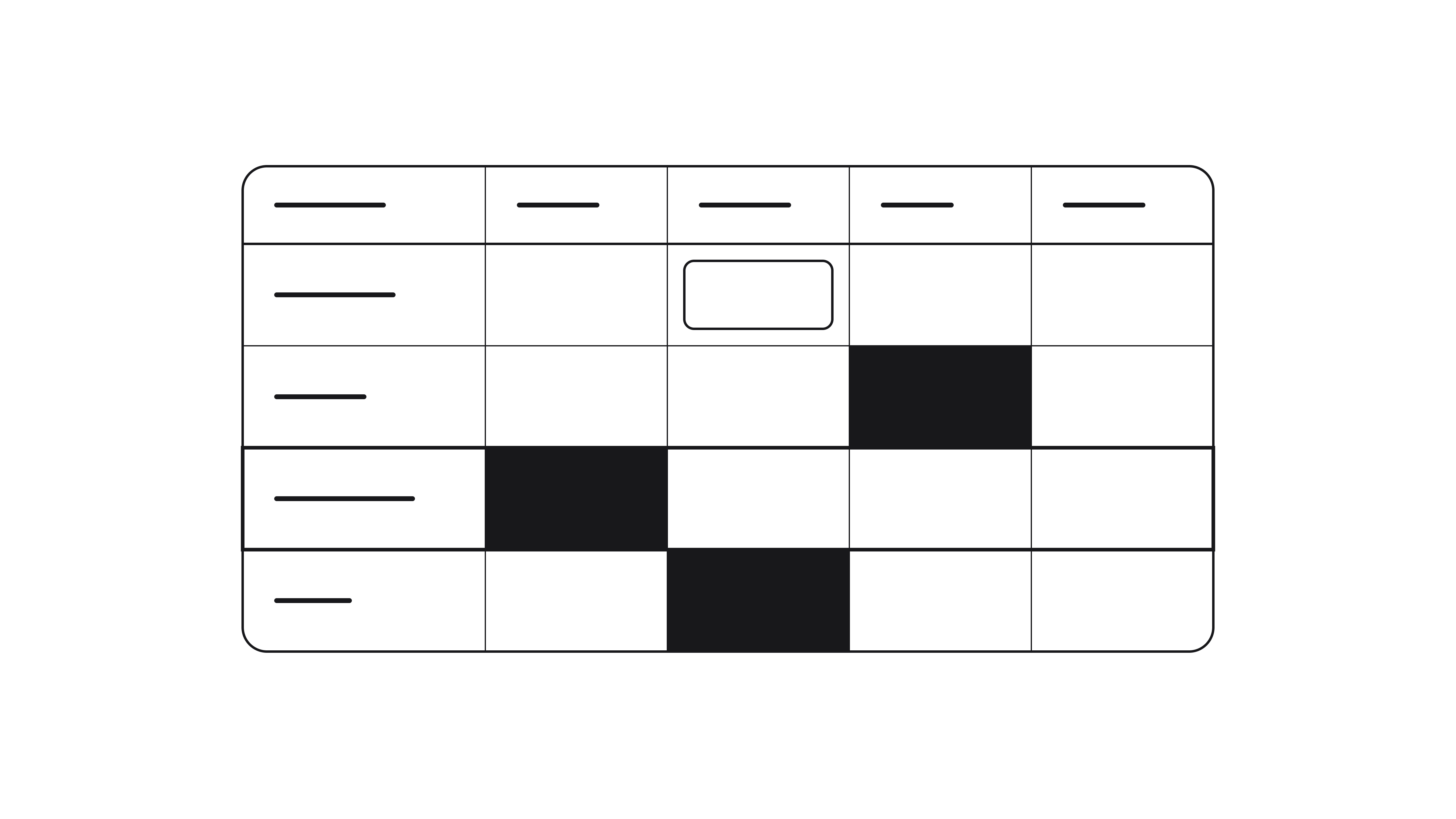
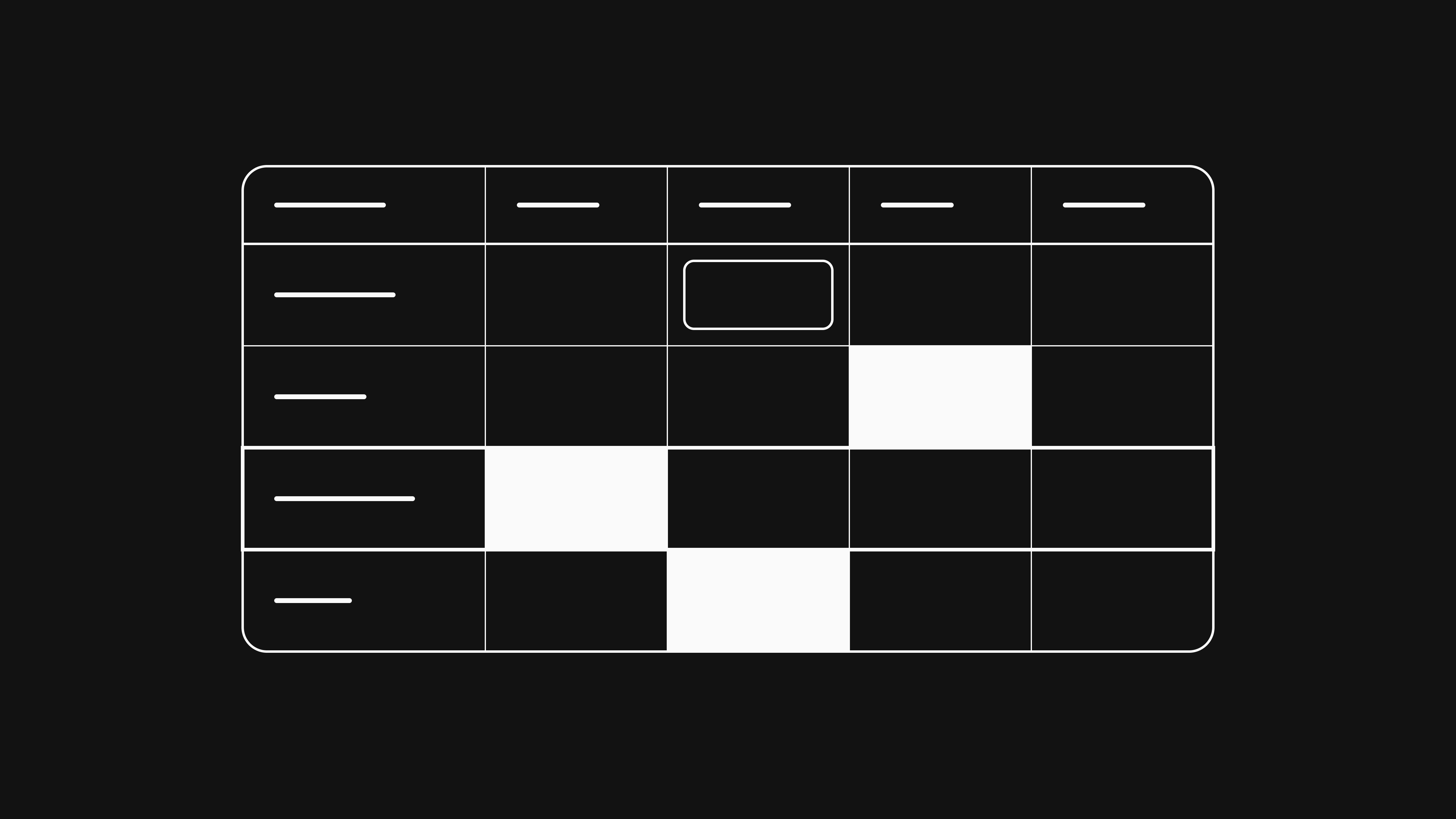
Most patent research starts with far more documents than anyone can read. A search for prior art or a competitor's portfolio easily returns thousands of patents, and the actual work is to narrow them down to the few that matter. Tables are built for exactly that: you start with everything and use filters and sorting to work your way down to the rows worth opening.
A table is a grid of records inside a research. Each row is one record and each table lists one kind of record, either patents or products. A dashboard shows the same data as charts of the whole set, so in general you use a table to triage and act and a dashboard to see the overall picture.
Here is an example of a patents table. The first columns carry the patent's own fields, and every product under review adds a column of mapping scores colored by risk:
| Patent | Applicants | Status | Aurora cell | Helios pack |
|---|---|---|---|---|
| Toyota+1 | In-force | Claim 1100% +3 | Claim 145% | |
| Samsung SDI | In-force | Claim 392% | ||
| LG Energy Solution | Filed | Claim 274% | Claim 574% | |
| Panasonic+1 | In-force | Claim 145% | ||
| QuantumScape | Filed | Claim 4100% | Claim 292% +2 | |
| CATL | Lapsed | Claim 645% |
One look tells you that two patents, Toyota's and QuantumScape's, fully match the Aurora column, a few more score high and the rest sit low enough to wait. The colors make it easy to scan thousands of scores in seconds.
Rows and columns#
Every row is one record, a patent or a product, never a mix. Columns come in three kinds:
- The identifier column names the record and is always present.
- Attribute columns carry the record's attributes, system and custom alike.
- Mapping columns show how the record scores against each record on the other side.
Identifier column#
The left-most column of a table is reserved for the identifier. On a desktop it stays pinned in place while you scroll the other columns sideways, and it is the one column you cannot hide. For patents the identifier is the publication number, for products the name.
| Patent |
|---|
| Product |
|---|
Attribute columns#
Attribute columns show a record's attributes: the system fields Patalyze fills in from the source and the custom fields you or an agent add. On a patents table that means titles, applicants, dates, classifications and status next to your own columns, e.g. a reviewer or a priority. A products table has the websites built in. Beside them you find whatever the research agent created and filled while it browsed, such as categories and manufacturers, plus anything you add yourself. Show the ones you need and hide the others. When the field you want does not exist yet, the plus button at the end of the columns is where you create it.
| Patent | Applicants | Status |
|---|---|---|
| Panasonic+1 | In-force | |
| QuantumScape | Filed | |
| CATL | Lapsed |
Mapping columns#
In patent research, mapping columns are usually the most important part of a table. Each one stands for a record on the other side: on a patents table, every product you are checking against adds a column. Where a patent and a product have been compared, the cell at their intersection holds the mapping between them.
A patent has many claims, but the cell leads with the strongest match: the independent claim that scores highest against the product, shown as a chip with its claim number and score. Other independent claims sit beside it and the remainder is collapsed into a count. Dependent claims stay out of the cell, since their score counts only their further elements; expand the cell or open a claim and they appear under the independent claim they depend on. A glance down the column tells you which patents come closest to reading on your product. Click a cell and choose "Open as panel" to read the mapping beside the table, or "Open as page" to walk through it claim by claim.
| Patent | Aurora cell | Helios pack |
|---|---|---|
Claim 1100% +3 | Claim 145% | |
Claim 392% | ||
Claim 274% | Claim 574% |
The color shows the score's risk band. Every cell falls into one of four bands, from critical down to low, so the dangerous matches stand out right away. The mappings section of the data model explains each band and the percentage range behind it.
The cell reads the same from either side. A products table puts your products in the rows and the patents in the columns, but a match that is critical on a patents table is critical there as well.
A mapping column covers every charted claim of a patent at once. If you want to follow a single claim instead, e.g. claim 1 of the patent you are testing against a table of prior art, you can show that claim as a column of its own. It holds the claim's score for every row the patent has been charted against, and for a dependent claim that is the share of its further elements. To add one, choose Show mapping, open the patent and pick the claim. On a patents table, the combined variant of that column lists the combinations of references each row is part of, best first, and each entry opens its chart.
Filtering#
Filtering is how you narrow down a table. Pick a column, choose an operator and the rows that fail the test drop away. Every option carries a count, so you can see how many rows a choice keeps before you commit. Add a filter from the toolbar, or open any column's header menu and choose "Filter by" to filter by that column directly.
The most useful move is filtering a mapping column to the critical and high bands. Thousands of rows collapse to the few patents whose claims actually threaten your product, and those are the ones worth opening.
Layer a second filter on top to sharpen the shortlist, e.g. a single applicant or in-force patents only. Once the list is right, tick the rows you want and a footer appears with four actions:
- Ask agent opens a research agent with exactly these records in hand, e.g. to fill an attribute for them or to chart them against a product. The same button appears when you select cells instead of rows.
- Copy puts the publication numbers or product names on the clipboard.
- Download exports the selection as CSV or Excel, columns included.
- Delete removes the selected records from the research, e.g. to clear out rows a filter proved irrelevant.
To download the whole table rather than a selection, use "Download as CSV" or "Download as Excel" from the page menu.
| Patent | Applicants | Status | Aurora cell | Helios pack |
|---|---|---|---|---|
| Toyota+1 | In-force | Claim 1100% +3 | Claim 145% | |
| Samsung SDI | In-force | Claim 392% | ||
| QuantumScape | Filed | Claim 4100% | Claim 292% +2 |
Sorting#
Where a filter removes rows, sorting reorders the ones that remain. Open a column's header menu and choose "Sort ascending" or "Sort descending". A small arrow on the header marks the active direction, and "Clear sorting" removes it again. If you sort a mapping column from high to low, the closest matches come first, even before you have set a single filter.
Searching#
Search jumps straight to a record you already have in mind. Type a publication number, a title or an applicant into the search box and the table keeps only what matches the text. A filter narrows by a rule and search narrows by free text, so when all you want is to pull up one known patent, search is faster than building a filter.
Visualizing a column as a chart#
Any column can become a chart without leaving the table. Open the column's header menu and choose "Visualize as chart". A preview appears, binned to suit the column: a status column as a breakdown, a date as a trend, an applicant as a ranking. The preview respects your filters, so it charts exactly the rows you have narrowed down to. "Add to dashboard" keeps the chart on a dashboard, or "Create dashboard" starts a new one if the research has none yet. Either way, your table's filters are saved with the chart.
Arranging columns#
Not every column needs to be on screen at once. Hide one straight from its header menu with "Don't show on this table", or open the display settings, where you can switch the row height between "Compact" and "Expanded", drag columns into a new order and add any hidden column back when you need it again.
A few more adjustments live on the header itself. Drag the edge between two headers to set a column's width and double-click that edge to reset it. Drag a header sideways to move the column, or use "Move left" and "Move right" in its menu to nudge it one step at a time. "Select all cells" selects the whole column, e.g. to copy it or to ask an agent about it.
Columns that show their values as badges can also be colored. Color is only useful when it points you at something, so we keep most columns neutral. Status, family, designated states, classifications, mapping columns and your select and multi-select attributes start colored. Applicants, assignees and inventors turn colored the first time a chart in your research uses their colors, so the table and the chart read the same way. To change it, simply open the column's header menu and choose "Enable coloring" or "Disable coloring". The choice belongs to this one table, and on a phone you set it separately in the display settings, just like the column order.
On a custom attribute, the header menu starts with "Edit attribute", which changes the attribute itself rather than this one table. "Delete" sits at the bottom of that form, and deleting there removes the column from every page and takes its values with it.
Adding columns#
The plus button at the end of the columns opens a search over the attributes that exist but are hidden. Type a few letters to find the one you want and click it to add the column. Beneath the attributes, "Show mapping" opens a list of the records that could become mapping columns, with its own search box. Below it, "Create new attribute" lets you define a field that does not exist yet.
A record that is not in the research at all has to be added first, through the Add data menu or a research agent. Once it is there, it shows up under "Show mapping" like any other. While a deep web search is adding products, the table header shows how many sources have been scanned as new products arrive in the rows beneath.